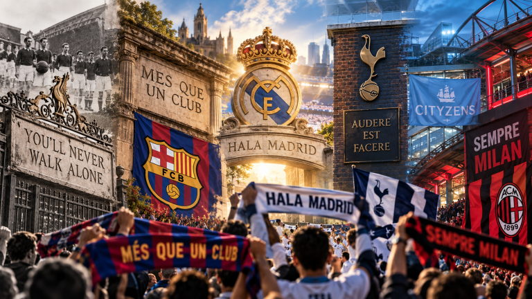
A football club’s colors can look permanent only because supporters have seen them repeated for generations. In reality, many famous combinations began as practical decisions made when clubs were young: a shirt was available, a founder preferred a particular color, an existing sporting institution already used it, or a team needed to distinguish itself from an opponent. What gives those choices lasting power is not the original decision alone, but everything that happens afterward. Matches, trophies, defeats, photographs, scarves, songs, family memories, and famous players gradually turn color into a visual shorthand for belonging.
That is why the history of football colors is more complicated than a catalogue of shirt designs. Some origin stories are well documented, while others have been simplified by repetition until legend sounds like fact. A useful history therefore has to separate what can be verified from what supporters remember, while still taking those memories seriously. The most interesting question is not simply why a club first wore red, blue, black, white, or green. It is how a practical uniform became something supporters could recognize from across a stadium and eventually treat as part of the club’s identity.
Before Club Colors Became Brands
Early football clubs did not choose kits in the way modern marketing departments launch seasonal collections. In the nineteenth century, obtaining matching clothing could itself be a challenge, and teams often relied on locally available materials or colors already associated with schools, workplaces, churches, athletic societies, or founders. Consistency mattered because players needed to tell teammates and opponents apart, but there was rarely a global audience judging whether a shirt matched a carefully managed brand identity. The visual language of football developed before clubs had modern logos, commercial sponsors, international retail networks, or social media campaigns.
Once a club kept returning to the same combination, however, repetition changed the meaning of the colors. A shirt that initially solved a practical problem could become recognizable within a town, then across a league, and eventually across countries. That transformation explains why modern supporters often experience club colors as inherited culture rather than as ordinary clothing. The fabric changes, manufacturers change, sponsors change, and shades can shift slightly, yet the underlying visual identity remains stable enough for different generations to feel that they are looking at versions of the same club.
Juventus: When a Replacement Kit Created a Lasting Identity
Juventus provides one of the clearest examples of a color change becoming far more important than the practical circumstances that produced it. The club began by wearing pink, but by 1903 it had adopted the black-and-white stripes that would define its public image. Juventus’ own historical material connects those colors to Nottingham and to Tom Gordon Savage, whose link with Notts County helped bring the striped shirts to Turin. What began as a change of kit became so deeply embedded in the club that “Bianconeri,” meaning black and whites, became one of its most familiar names.
The Juventus story matters because it shows that football identity does not require an ancient symbolic meaning at the moment a color is chosen. Supporters can create meaning afterward. Decades of players wearing the same stripes, major victories, photographs, banners, and memories made black and white inseparable from the club’s image. The origin is historically interesting, but the cultural importance comes from continuity. A borrowed visual idea was transformed through use until it no longer felt borrowed at all. It became Juventus, demonstrating how football can turn an accidental or practical decision into a tradition that appears inevitable in hindsight.
Liverpool: How All Red Became a Statement of Power
Liverpool’s modern visual identity also developed over time rather than appearing fully formed at the club’s birth. When Liverpool were founded in 1892, their early kit was blue and white before red and white became established. The most famous change came under Bill Shankly in 1964, when the club moved toward the all-red appearance now recognized around the world. Liverpool’s own history records Shankly’s belief that a stronger field of red could make his players look more imposing, turning color into part of the psychological presentation of the team rather than treating it as decoration.
The change acquired meaning because results, personalities, and supporter memory reinforced it. Red became associated not only with a design choice but with the era in which Liverpool were developing into a major domestic and European force. Later generations inherited the color together with stories about Shankly, Anfield, the Kop, famous finals, and celebrated players. This is one reason club colors can become emotionally resistant to change. Supporters are not reacting only to a pigment or fabric sample. They are reacting to a visual container that holds decades of collective memory, including experiences they may know only through family stories and archival images.
Arsenal Shows Why Kit Origins Need Careful Research
Football history is full of attractive stories that survive because they are easy to repeat, and Arsenal’s red provides a useful warning about treating familiar explanations as settled fact. One long-circulating account claimed that Nottingham Forest supplied Arsenal’s founders with red shirts. Arsenal’s more recent archival treatment has challenged that version, drawing on testimony from founder David Danskin that new red shirts were purchased from an outfitter after Fred Beardsley suggested the color. The disagreement is valuable because it demonstrates why club-color history should be researched rather than simply copied from the most popular retelling.
This does not make supporter folklore worthless. Legends reveal what communities choose to remember and how clubs build stories around themselves, but folklore and documentary evidence answer different questions. A strong football history can acknowledge both without pretending they are identical. For SwiftPeak, that distinction is especially important because the culture of football is built from official records, material objects, journalism, photographs, and supporter memory at the same time. Club colors sit at the intersection of all of them, which is why even a seemingly simple question about a shirt can reveal how historical knowledge is created and passed down.
Barcelona: Continuity Can Matter More Than a Perfect Origin Story
Barcelona offers a different lesson. The club’s blue-and-garnet combination has been part of its identity for more than a century, and the team itself is widely described through the word “blaugrana.” The long continuity of those colors matters even when supporters encounter competing explanations for exactly why they were chosen in the first place. What is certain is that repeated use allowed the combination to become one of football’s most recognizable visual identities, connecting different eras of the club even as shirt construction, sponsors, manufacturers, and graphic styles changed around it.
That continuity shows why the cultural life of a color can become more important than the uncertainty surrounding its earliest explanation. Supporters learn visual identity through repetition: seeing the same combination on childhood heroes, family photographs, flags, scarves, matchday programmes, and stadium displays. Over time, the colors begin to stand for the institution itself. This is closely connected to the way football clubs represent place and community, a theme explored elsewhere on SwiftPeak in Football and Local Identity: Why Clubs Represent Their Communities. A color becomes powerful when people repeatedly attach shared experience to it.
Why Repetition Turns Color Into Identity
The strongest club colors work almost like a visual language. Supporters can recognize a team from a section of fabric, a scarf at a railway station, or a distant block of supporters before they can read a badge. That recognition develops because the same colors appear across many forms of football life at once. They are worn by players, displayed by fans, printed in programmes, used in stadium decoration, reproduced in photographs, and passed between generations through shirts kept long after a season has ended. Repetition makes the color familiar, while memory gives the familiarity emotional weight.
This helps explain why shirts often become symbols of belonging rather than ordinary sportswear. A supporter may associate one design with a first match attended with a parent, another with promotion, another with relegation, and another with a player who defined an era. The club’s colors provide continuity across those changing experiences. SwiftPeak examines this wider relationship between clothing and identity in How Football Shirts Became Symbols of Identity and Belonging. The important point is that meaning accumulates through use; it is rarely created by design alone.
Why Redesigns Can Provoke More Than a Fashion Argument
Supporters usually accept that collars, patterns, sponsors, fabrics, and secondary details will change. Football shirts have always evolved, and many fans enjoy the differences between eras. Resistance becomes stronger when a redesign appears to threaten something regarded as fundamental, especially a home color closely tied to the club’s public identity. At that point the disagreement is no longer simply about whether a shirt looks attractive. It becomes a debate about who has authority to redefine a symbol that supporters feel they have inherited through years of loyalty.
Commercial logic can intensify that tension because clubs now operate in a global merchandise market where novelty encourages repeat purchases. A manufacturer may want a design that stands out internationally, while local supporters may value continuity precisely because it resists constant reinvention. Neither side automatically makes every change good or bad, but successful designs usually understand the difference between refreshing a tradition and replacing it. The most effective modern kits often introduce new details while preserving the color relationships that allow supporters to recognize the club immediately.
Away Kits Give Clubs More Freedom to Experiment
Away and third kits occupy a different cultural space because they are less constrained by the expectation of permanent home identity. Clubs can use unexpected colors, revive forgotten combinations, reference local landmarks, or reinterpret designs associated with previous generations. Some change kits become cult favorites precisely because they are unusual. Arsenal’s “bruised banana” design is a good example of an away shirt whose visual character became memorable enough to be revisited decades later, showing that experimentation can itself become part of club heritage when supporters attach strong memories to it.
The freedom of an away kit also reveals the difference between temporary fashion and lasting identity. A striking alternative shirt can be celebrated without replacing the home colors that anchor the club’s visual continuity. This balance allows football clothing to operate in two directions at once: home kits protect recognition, while away kits create room for design experimentation and nostalgia. That relationship helps explain why retro shirts now circulate far beyond stadiums as fashion objects, a development explored in How Retro Football Shirts Moved From the Terraces Into Fashion.
Club Colors in a Global Merchandise Market
Modern clubs sell shirts to supporters who may live thousands of miles from the stadium, and this global reach changes how color operates. A home kit must remain instantly recognizable on television, social media, retail displays, and digital games while also satisfying supporters who understand every small historical reference. Manufacturers therefore work with a difficult combination of continuity and novelty. Too little change can make a new release feel unnecessary, but too much change can make the shirt feel disconnected from the identity that gives it value in the first place.
This commercial environment does not automatically make modern shirts less meaningful. New designs can become part of club history if supporters attach important moments to them. A shirt launched as a product can later become a reminder of a title, a memorable player, an away journey, or a particular stage of someone’s life. The relationship between commerce and culture is therefore not one-directional. Clubs and manufacturers produce the object, but supporters help determine which designs disappear into seasonal catalogues and which ones survive as symbols people continue wearing years later.
Colors, Badges, and the Visual Language of a Club
A football club rarely communicates identity through color alone. Badges, shirt patterns, stadium architecture, typography, flags, and supporter displays all interact to create a recognizable visual world. Colors provide the fastest layer of recognition, while crests often carry more explicit references to local history, symbols, industries, or institutions. Reading the two together gives a fuller picture of how clubs represent themselves. SwiftPeak explores that relationship further in The Meaning Behind Football Club Badges and How They Evolved, where visual identity is examined through the symbols placed directly on the shirt.
The connection also explains why redesigning a badge can produce reactions similar to changing a core color. Supporters understand visual identity as something accumulated rather than invented from zero each season. Even when a club modernizes, the most successful changes usually preserve enough recognizable continuity to connect the new design with what came before. Football is unusually powerful at turning simple visual elements into shared cultural property, and colors are among the clearest examples. They are controlled institutionally, sold commercially, worn individually, and interpreted collectively at the same time.
What Iconic Kits Really Tell Us About Football
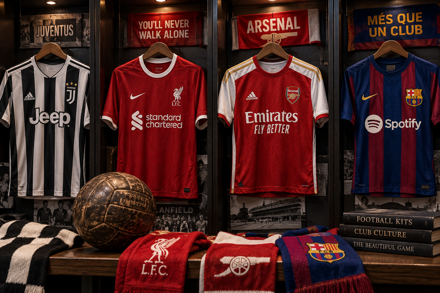
The history of club colors shows that football traditions do not need to begin with grand symbolism in order to become meaningful. Juventus’ black-and-white stripes, Liverpool’s move toward all red, Arsenal’s long association with red, and Barcelona’s blue-and-garnet identity all developed through different historical paths. What connects them is repetition. Each combination became powerful because generations of football life accumulated around it. Color provided continuity while the people wearing it, watching it, buying it, and remembering it supplied the meaning.
That is why iconic kits should be understood as cultural objects rather than simply successful designs. They sit between institution and supporter, history and commerce, local memory and global recognition. A club can choose a color, but it cannot fully control what that color will eventually mean. Meaning develops through time, competition, memory, and community. The most enduring football colors survive because supporters continue to recognize themselves in them, turning something as ordinary as fabric and dye into one of the strongest visual languages in sport.