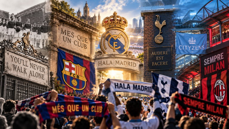

A football club badge may occupy only a small area of a shirt, but it can carry an extraordinary amount of history. Inside one crest there may be references to a city, an industry, an animal, a religious tradition, a local landmark, a former workplace, a nickname, or colors that supporters have recognized for generations. That is why apparently minor changes to a badge can produce reactions far greater than its physical size would suggest. Supporters are not simply looking at graphic design; they are looking at a symbol through which the club identifies itself.
Football badges have also changed considerably. Early clubs did not always wear permanent crests on every shirt, while modern teams reproduce their symbols on kits, websites, stadiums, television graphics, mobile apps, merchandise, social media, and products sold around the world. Designs therefore have to carry historical meaning while remaining clear at very different sizes. The history of football badges is a story about local identity, visual communication, commercial growth, technology, and the difficult question of how much a club can change without becoming visually disconnected from its own past.
Football Clubs Did Not Always Wear Permanent Badges
Modern supporters are accustomed to seeing a club crest permanently positioned on the shirt, but that was not always normal. In the early decades of organized football, team colors were often more important than a permanent embroidered emblem. Clubs could be recognized through shirts, caps, monograms, civic symbols, or special badges produced for important matches rather than through one standardized logo used everywhere.
This made sense in a period when football clubs had far fewer commercial products and communication channels. A team did not need one image that worked simultaneously on a television screen, smartphone icon, stadium facade, replica shirt, online shop, and international advertising campaign. As clubs became larger institutions, however, a consistent visual symbol became increasingly useful.
Badges Often Began With the Identity of the Town or City
Many early football clubs borrowed from civic heraldry because their strongest identity was geographical. A coat of arms already contained symbols understood locally: castles, ships, crosses, animals, rivers, crowns, plants, tools, or other objects associated with the history of a town. Using those elements allowed a football team to present itself as a representative of the place rather than merely a collection of eleven players.
This relationship remains important because football clubs frequently claim to represent communities extending far beyond the stadium. SwiftPeakX explores that connection in Football and Local Identity: Why Clubs Represent Their Communities. A crest can compress that larger relationship between club and place into an image small enough to wear over the heart.
FC Barcelona Initially Used the City’s Own Coat of Arms
FC Barcelona provides one of the clearest examples of the relationship between civic identity and club identity. According to the club’s official history, Barcelona originally used the coat of arms of the city itself. The choice made the relationship explicit: the new football organization was presenting itself through symbols belonging to the city in which it had been founded.
That arrangement lasted until 1910. By then, the club had developed enough institutional identity to seek a crest of its own. Barcelona held a competition among members for a new design, and the winning concept established the basic structure that continues to define the crest more than a century later.
Barcelona’s 1910 Crest Combined City, Region, Club, and Football
The design adopted in 1910 brought several identities into one shield. The upper section contains the Cross of Saint George, associated with the patron saint of Catalonia and also present in Barcelona’s civic heraldry, alongside the red-and-yellow stripes representing Catalonia. The lower section contains Barcelona’s blue-and-garnet club colors and a football.
This structure demonstrates why football badges can become so powerful. The image simultaneously communicates city, regional identity, sporting purpose, and club colors. Someone who understands the symbols can read several layers of history without a sentence being written. The crest functions almost like a visual summary of what the institution believes it represents.
Political History Can Leave Marks on a Football Crest
Badges do not exist outside the political environments surrounding clubs. Barcelona’s official crest history records changes imposed during the Franco dictatorship, including alterations to the club initials and the representation of the Catalan stripes. Later changes restored elements of the earlier identity.
This makes the evolution of a crest more than a sequence of design decisions. In some cases, changing letters or symbols can reflect much larger struggles involving language, regional identity, government authority, or political pressure. A badge may therefore become historical evidence showing how football institutions were affected by events far beyond the pitch.
Liverpool’s Liver Bird Connects Club Identity With the City
Liverpool FC provides another strong example of a symbol moving from civic identity into football culture. The Liver Bird has long been associated with the city of Liverpool and appeared in different forms within the club’s visual identity. Liverpool’s own archive records that the bird was used on club correspondence and on medals presented after the 1901 league championship.
The symbol gradually became more visible. It appeared on programmes, flags, and other club material before eventually reaching the playing shirt. By that stage the bird was no longer simply a civic reference borrowed temporarily by the football club. Generations of repetition were turning it into one of the most recognizable symbols associated with Liverpool FC itself.
The Liver Bird First Appeared on Liverpool’s Kit in 1950
Liverpool first wore the Liver Bird on a playing shirt in connection with the 1950 FA Cup Final against Arsenal. The emblem appeared inside a shield on the white away shirt. It was an important visual moment because a symbol already associated with the club finally moved directly onto what the players wore during competition.
The design continued evolving. Different versions placed the Liver Bird inside an oval, displayed the initials LFC, removed surrounding shapes, changed colors, and eventually became part of more elaborate official crests. Yet the central bird survived. This is a common pattern in football design: the surrounding graphic language changes while one core symbol remains recognizable across generations.
A Badge Can Become Simpler Without Losing Its History
Liverpool’s modern use of the Liver Bird also demonstrates why football clubs increasingly need flexible visual identities. In 2024, Liverpool announced that the simplified Liver Bird emblem would be used more widely across digital platforms and broadcasting. One reason was practical: the simpler symbol remains clearer when displayed in very small spaces on mobile devices and social-media interfaces.
The club did not abandon its full official crest. Instead, different versions of the identity serve different purposes. A detailed crest can work on stadium architecture or official documents, while the Liver Bird can function more effectively as a compact digital mark. Modern football branding therefore does not always require choosing between history and simplicity; clubs can establish a hierarchy of symbols.
Arsenal’s Cannon Carries the Memory of the Club’s Origins
Arsenal’s visual identity is another example of football preserving industrial history. The club was founded in Woolwich by workers connected with the Dial Square armaments factory. The language of weapons and artillery remained associated with the club even after Arsenal moved across London, eventually becoming central to the cannon symbol seen throughout its crest history.
The cannon works particularly well because it connects several parts of Arsenal identity at once. It refers to the industrial origin of the club, reinforces the Gunners nickname, and remains recognizable even when separated from the full Arsenal shield. SwiftPeakX explores this relationship between club history and language in Why Football Clubs Have Nicknames and What They Reveal.
Nicknames and Badges Often Reinforce Each Other
Sometimes a nickname produces visual imagery; in other cases the image strengthens the nickname. Arsenal’s cannon and the Gunners, Newcastle’s Magpies imagery, Norwich’s Canary, and many other examples demonstrate how language and design become connected. After enough repetition, it can become difficult to determine which element supporters experience as primary.
This relationship is valuable because different supporters encounter clubs in different ways. A child may recognize an animal on a mascot before understanding the historical nickname. Another supporter may learn the nickname first through commentary and only later discover why the same animal appears on merchandise or badges. Football identity is built through several overlapping visual and verbal systems.
Mascots Can Turn Badge Symbols Into Living Characters
When an animal or figure from the club’s identity becomes a mascot, a static visual symbol gains movement and personality. The character can interact with supporters, appear at community events, and introduce children to club history in a way a formal crest cannot.
SwiftPeakX explores that process in How Football Mascots Became Part of Club Identity. Badges and mascots serve different purposes, but they frequently draw from the same historical material. One may function as the official institutional mark while the other presents that symbolism in a playful matchday form.
Manchester City’s Badge Shows How Redesign Can Return to History
Badge redesign is often described as modernization, but Manchester City’s current crest demonstrates that a modern redesign can deliberately return to older visual traditions. The badge launched in 2016 restored the circular form associated with earlier City crests rather than simply pursuing an entirely new shape.
Manchester City stated that the redesign incorporated important Manchester symbols: a ship, three rivers, and the red rose of Lancashire. The founding year, 1894, was also added. The design therefore attempted to modernize the club’s identity while making historical and geographical references more explicit rather than removing them.
Supporter Consultation Can Change the Redesign Process
Manchester City’s 2016 badge was preceded by a thirty-day consultation with supporters. Fans were asked about the shape, colors, and elements they wanted represented. This is important because redesigns can become controversial when supporters feel a permanent piece of collective identity has been altered without meaningful involvement.
A football club legally controls its branding, but culturally the badge is experienced collectively. Supporters buy it, wear it, display it at home, tattoo it on their bodies, place it on flags, and pass it to children. Consulting them does not guarantee universal agreement, but it acknowledges that the symbol has emotional stakeholders beyond the club’s design and commercial departments.
Why Badge Redesigns Can Produce Strong Reactions
Graphic designers may judge a crest by balance, clarity, scalability, typography, and reproduction quality. Supporters often judge it through memory. An awkward shape may be associated with childhood shirts, a grandparent, a promotion season, or a famous cup final. Removing it can therefore feel less like improving a logo and more like changing part of personal history.
This explains why technically competent redesigns can still fail emotionally. A new crest may be cleaner and easier to reproduce while appearing generic to supporters. The strongest redesigns usually identify which details are essential to recognition before simplifying everything around them.
Supporters Usually Accept Evolution More Easily Than Erasure
Football badges have never been completely static. Lines become cleaner, lettering changes, shield proportions shift, colors are standardized, and printing technology allows different levels of detail. Supporters can accept substantial evolution when the underlying identity remains recognizable.
The greater problem comes when familiar local references disappear without an obvious replacement. If a castle, animal, ship, cannon, bird, or civic symbol has represented the club for generations, removing it can create the impression that history is being sacrificed for a generic global brand. The disagreement is therefore usually about belonging rather than nostalgia alone.
Shirt Manufacturing Influenced Badge Design
A badge is not created only for paper. It has to function on fabric. Embroidery, stitched patches, heat transfers, printing, woven labels, and modern performance materials all place different constraints on detail. A design containing many tiny lines may look beautiful on a large poster but become difficult to reproduce clearly on a shirt.
This practical pressure helps explain why some crests became simpler as replica-kit production expanded. Clearer geometry and fewer tiny details can improve consistency across player shirts, children’s sizes, training wear, jackets, and supporter merchandise. Technology changes how identity can be manufactured.
The Badge and the Football Shirt Became Increasingly Connected
Once badges became permanent features of football shirts, supporters began experiencing the two as one visual object. Club colors create the large field of identity, while the crest identifies the institution directly. A shirt without the expected badge can therefore look incomplete even when the colors are immediately recognizable.
SwiftPeakX explores the wider emotional meaning of the shirt in How Football Shirts Became Symbols of Identity and Belonging. The badge strengthens that process because it transforms fabric from a set of colors into something explicitly connected with one club.
Club Colors Help Make the Badge Recognizable
Color is often one of the most stable parts of visual identity. Even when a badge changes shape, familiar combinations can preserve recognition. Barcelona’s blue and garnet, Liverpool’s red, Arsenal’s red and white, and other established palettes allow supporters to identify club imagery before reading any lettering.
This relationship works in both directions. The crest standardizes the club’s visual palette, while the shirt spreads those colors through stadiums, television, scarves, flags, and supporter clothing. SwiftPeakX examines how colors become symbolic in Why Football Clubs Wear Their Colors: The Stories Behind Iconic Kits.
Badges Became More Important as Replica Shirts Expanded
The rise of the replica-shirt market turned club crests into objects supporters wore far beyond matchday. A badge could appear on a child at school, a supporter travelling abroad, or someone wearing a football shirt as everyday clothing rather than stadium apparel. Club identity began moving through public space in new ways.
This dramatically increased the commercial value of crest design. A recognizable badge could identify merchandise even when no player was present and no match was being played. The symbol became one of the most valuable pieces of intellectual property associated with the club.
Trademark Protection Changed the Legal Meaning of the Crest
As merchandise and sponsorship revenues grew, football clubs increasingly needed to protect their badges legally. Unauthorized reproduction no longer represented only misuse of a historical symbol; it could interfere with commercial licensing, official products, partnerships, and brand value.
This creates an unusual dual identity. Emotionally, supporters may regard the badge as something belonging to the community. Legally and commercially, the club normally controls how the official mark can be reproduced. Modern football crest culture therefore sits between collective memory and corporate intellectual property.
Sponsors Made the Shirt More Commercial, but the Badge Remained the Club
Modern football shirts can contain manufacturer marks, sponsors, competition patches, charity campaigns, and other commercial elements. Most of these relationships are temporary. A sponsor visible across the front of the shirt for several seasons can disappear completely when a commercial agreement ends.
The club badge operates differently. It is expected to remain through those changes. This gives the crest a particular symbolic status: while many other graphics explain who is paying to appear on the shirt or who manufactured it, the badge tells supporters whose shirt it fundamentally is.
Television Increased the Need for Instant Recognition
Broadcasting turned club badges into visual identifiers for enormous audiences. Television graphics place crests beside scores, fixtures, league tables, substitutions, and match statistics. A viewer may see the badge dozens of times during one broadcast even when the camera is nowhere near the players’ shirts.
This encouraged designs that remain recognizable quickly and at small sizes. A complicated historical crest can work beautifully on a stadium wall but lose clarity when reduced to a tiny score graphic. Modern identity systems therefore increasingly require multiple approved versions rather than forcing one design to perform every possible task.
Smartphones Created an Even Smaller Design Problem
The smartphone made scale even more important. Supporters now encounter club symbols as profile pictures, app icons, notification graphics, social-media avatars, and tiny thumbnails. These spaces are much smaller than an embroidered shirt badge and may be viewed for only a fraction of a second.
Liverpool’s expanded use of its standalone Liver Bird illustrates this adaptation. The club specifically noted the importance of clearer and more legible branding across digital platforms heavily accessed through mobile devices. Historical football symbols now have to survive environments that their original designers could never have imagined.
Simplification Does Not Automatically Mean Losing Meaning
Football supporters sometimes associate simpler badges with commercial modernization, but simplicity itself is not necessarily the problem. A symbol can become simpler while preserving the distinctive object supporters care about. A standalone cannon, bird, monogram, or other historically established mark may communicate identity more efficiently than an overloaded shield.
The question is what has been simplified. Removing decorative details may improve clarity. Removing the one symbol that connects the club to its town or history can have the opposite effect. Good redesign requires understanding the hierarchy of meaning inside the badge rather than treating every line as equally important.
A Badge Can Contain Religious and Cultural Symbols
Some football crests contain crosses, saints, religious imagery, or symbols inherited from civic heraldry with religious origins. These features may have existed in the city’s identity long before the football club adopted them. Their appearance on a crest therefore does not always indicate that the club itself was founded primarily as a religious institution.
Context matters. Barcelona’s Cross of Saint George, for example, functions as a connection with Barcelona and Catalan civic identity inside the crest. Reading football badges historically requires asking where each symbol came from rather than assigning modern meaning without investigating its origin.
Ships, Rivers, Factories, and Tools Preserve Working History
Industrial imagery appears frequently because football expanded rapidly inside towns transformed by manufacturing, trade, ports, railways, and heavy industry. Ships can refer to commerce and canals, tools to local work, and factories or industrial motifs to communities whose livelihoods shaped the club’s earliest supporter base.
Manchester City’s ship is a useful example because it connects the football crest with Manchester’s civic and commercial history. Symbols like this can remain long after the economic structure of the city changes. Football thereby preserves older images inside a modern entertainment industry.
Animals Give Crests Immediate Personality
Animals are particularly effective badge symbols because they are visually distinctive and easy to transform into other forms of supporter culture. Birds, lions, foxes, wolves, bees, and other creatures can move from the crest to flags, songs, nicknames, children’s merchandise, and mascots.
The symbolism can come from heraldry, geography, local wildlife, historical stories, or an established nickname. Once the connection becomes familiar, supporters may stop consciously separating the animal from the club. The creature simply becomes another visual shorthand for belonging.
Letters and Monograms Can Become Just as Powerful
Not every famous badge requires complex imagery. Initials, intertwined letters, geometric forms, and simple shields can become enormously recognizable through repetition. The design may begin as straightforward identification, yet decades of victories, defeats, players, stadium memories, and family traditions gradually give it emotional weight.
This is an important point because meaning does not always need to be visible in the original graphic idea. A simple monogram may contain little local history when first created, but history accumulates around it. Supporter attachment can transform ordinary typography into one of the strongest symbols in world football.
Anniversary Badges Turn Time Into Design
Clubs sometimes temporarily modify crests to mark centenaries, championships, memorials, or other milestones. Dates, stars, wreaths, special lettering, or historic versions of the badge can appear on shirts for one season. These designs deliberately connect the present team with earlier generations.
Liverpool’s centenary crest in 1992 is one example of football using design to mark institutional time. Anniversary badges show how crests can act almost like historical documents. A supporter can sometimes identify the season of an old shirt simply from the particular version of the emblem used.
Memorial Elements Can Give a Badge Deeper Emotional Weight
Football crests can also carry memorial symbolism. Liverpool’s crest developed to include eternal flames commemorating the victims of the Hillsborough disaster. These elements demonstrate how a club’s visual identity can absorb events that occurred long after the original emblem was created.
Such additions are fundamentally different from ordinary branding decoration. They become part of institutional remembrance. Removing or altering them therefore carries emotional significance far beyond graphic preference, because supporters understand that the symbol refers to real people and collective history.
Badge History Is Also Shirt History
Looking through old shirts reveals how crest design changed alongside fabric, manufacturers, colors, collar styles, sponsors, and printing methods. A badge embroidered heavily onto a cotton shirt creates a different physical impression from a lightweight modern transfer applied to performance fabric.
This material history helps explain why supporters collecting old football shirts often care about the exact crest variation. Two shirts with similar colors can represent different eras because the badge shape, stitching, lettering, or surrounding symbols changed. The crest becomes a timestamp embedded in the garment.
Retro Badges Can Return When Supporters Want Historical Continuity
Modern football has repeatedly revived older crest styles on anniversary shirts, third kits, lifestyle collections, and heritage merchandise. The appeal comes partly from nostalgia but also from design. Older symbols can appear distinctive in an era when many modern brands move toward similar minimalist aesthetics.
This return also shows that badge evolution does not always move in one direction from complex to modern. Clubs can simplify, restore, reinterpret, and temporarily reuse historic emblems. Visual identity behaves more like an archive from which different generations select useful elements.
Global Support Made Local Symbols Travel Further Than Ever
A crest originally built from one city’s ship, bird, cannon, cross, or industrial past may now be recognized by supporters on another continent who have never visited the club’s stadium. Global broadcasting and merchandise transformed local symbols into international identifiers without necessarily changing their origins.
This creates one of modern football’s most interesting contradictions. The more global the audience becomes, the more valuable authentic local identity can be. A badge linked clearly with a particular place offers something that generic branding cannot reproduce easily: a story rooted somewhere specific.
Supporters Often Become Guardians of Visual Continuity
Club executives and designers may come and go, but supporters can spend entire lives looking at the same badge. This gives fan communities a long institutional memory. They remember which symbols disappeared, which versions accompanied important seasons, and which redesigns felt closest to the club they grew up following.
That memory gives supporters influence even when they do not legally control the crest. Strong criticism can force clubs to explain redesigns more carefully, conduct consultations, or reconsider unpopular changes. Football branding is therefore unusual: the owner of the trademark and the emotional community surrounding it are not exactly the same thing.
The Badge Is Carried Into Everyday Life
A club crest leaves the stadium constantly. Supporters display it on shirts, scarves, jackets, car stickers, phone cases, bedroom walls, flags, jewellery, tattoos, social-media profiles, and countless other objects. In each case the badge communicates allegiance without requiring an explanation.
This gives the crest a function closer to a social symbol than simple corporate decoration. Two strangers can recognize shared allegiance from one small image. A supporter travelling thousands of kilometres from home can encounter the badge and immediately understand that another person follows the same club.
Children Often Learn the Badge Before the History Behind It
Young supporters frequently recognize a club crest long before understanding the symbolism contained inside it. They know which badge belongs to their family’s team, can identify it on television, and may draw it from memory without knowing why a particular animal, ship, cross, or cannon is present.
Later, discovering those meanings can become an introduction to football history. The crest works almost like a map containing questions waiting to be asked: Why is there a bird? Why that particular cross? Why a ship? Why a cannon? Investigating the answers connects supporter identity with history beyond results and trophies.
A Badge Can Change While Still Remaining Recognizably the Same
The history of major football crests demonstrates that continuity does not require perfect visual immobility. Barcelona’s crest has undergone aesthetic adjustments since 1910. Liverpool has used different arrangements around the Liver Bird. Manchester City returned to a round form while incorporating traditional symbols into a modern design.
The common principle is recognizability. Supporters can accept changes when the redesigned image still communicates the history and visual language they associate with the club. Evolution becomes more difficult when the new emblem appears disconnected from everything that came before it.
Why Football Club Badges Remain So Powerful
A football badge remains powerful because it offers continuity in a sport defined by constant change. Players leave, managers are replaced, owners sell clubs, sponsors disappear, stadiums are rebuilt, and competitions reorganize. The crest can remain present through all of those transitions, connecting people who followed the team in completely different eras.
Its meaning comes from more than graphic design. The strongest badges contain pieces of place, history, color, community, and memory, then gain additional significance through decades of use. Supporters see them on shirts worn during triumph and disappointment, on scarves inherited from relatives, and on objects carried into everyday life. That accumulation of experience turns a small emblem into one of football’s most emotionally charged forms of visual identity.
Continue Exploring SwiftPeakX
Football badges connect naturally with club colors, shirts, nicknames, mascots, and local identity. Continue with Why Football Clubs Wear Their Colors: The Stories Behind Iconic Kits, How Football Shirts Became Symbols of Identity and Belonging, Why Football Clubs Have Nicknames and What They Reveal, How Football Mascots Became Part of Club Identity, and Football and Local Identity: Why Clubs Represent Their Communities. Together, these stories show how football turns colors, places, language, and historical symbols into identities capable of surviving for generations.